Saturday, March 31, 2012

Project 2, Stage 4 embroidery

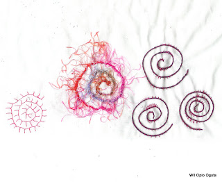
More exploration of stitches and the effect they give. My books have not yet arrived, but through Google I found this site on which a huge range of embroidery stitches is mentioned. My collection of yarn is still small so the choices I could make are limited. The designs are based on some of the mark makings I did earlier on in this project.
On the first picture at the right I used a splitstich done with hand dyed yellow DMC embroidery floss. The design on the right is made from a blue fruit nett and yellow floss.


On this picture is a variety of stitches. The top one on the left is a coral stitch, next to that an open Cretain stitch. The long one at the right is an interlaced running stitch. The spiral in the middle is a white yarn couched down with a herringbone stitch and the crescent shape is made with French knots.
My experience with hand embroidery is limited. It is something I will have to work on the coming months. That is the reason I signed up for Sharon's class (see link above). It will give me more change to experiment with stitches and I will end up with a range of fiber cards :-).

Friday, March 30, 2012

Project 2, stage 3 sample

For this sample I looked through my mark makings for an inspiration source. And this is the one I have chosen:

Cris cros lines of different thickness. As background fabric I picked one of my sunprints. The sample is made of contrasting colors, but I wanted to do the fabric sample in softer closely related colors in a combination of machine and hand stitching.

As you can see the colors are closely related. Actually too closely related. Depending on how the light touches the fabric some of the zig zag lines hardly show. This is the main thing I learned when making this sample. To balance this a bit, I did the hand stitching in rather deep purple/brownish rayon thread.
I like the combination of machine and hand stitching. Only as I said the colors of the thread don't show enough. Lesson learned for a next case.

As I mentioned above I was not happy with the result so I decided to make another sample using the same mark as inspiration source. Again in the same color range, but with a much better contrast:
With this sample I used only machine stitching because I did not think this sample would improve if hand stitching was added. As you can see, the same sunprint as background fabric with two different yarns couched on it. Simple, not very time consuming, but it gives a nice effect.

Wednesday, March 28, 2012

Project 2, Stage 2 mark making with stitches

Again mark making but this time with different white/whitish thread/yarn on a black Kona fabric background. I experimented with different thread and distance between stitching lines. The 'squares' are done with machine stitching, all the other ones are hand stitched.

I am not happy with the couched yarn. It does not fit in with the rest. But that is the good part of experimenting, you find out what works and what does not. Same goes for the spirals. The one at the left is only done once with a thin thread, the one at the right has multiple stitching lines close to each other which make it really stand out. For the lines at the bottom I used a lose stern stich and I have to say I like the effect. It is more flowing than a straight line made with a double running stitch.
What else do I like? The different effect the squares give, depending on whether the lines are straight or more flowing and how dense they are stitched. Each one is different, but they fit very well together too. The loose stitching under the squares I love. I stumbled upon this type of hand stitching by accident when I saw how the couching of the yarn looked like. No idea whether there is an official name for this type of stitching or not, but I will use it more often. My book on stitches has not yet arrived, so I cannot check for a name.

Monday, March 26, 2012

Project 2: developing your marks

For this I picked out the spiral which I drew in one of the earlier exercises. I did both machine stitching as well as hand stitching. For the machine part I played a bit with different stitches and I have to say I really like the zig-zag effect I got on some of them. Next to that I also practised some hand stitching using different threads and yarns.
 And I discovered that my machine does not like bobbin stitching. With this technique you work up-side down. No matter how I adjusted the tension it did not turn out very nice. I remember that once in a workshop I was told that when you have a machine with a drop in bobbin you cannot use this technique on that machine.  And all my machines are like this.  As this technique did not work out, I couched another yarn on the fabric which gives a similar effect.
The fabric I used for these samples was a P&B cotton.

Sunday, March 25, 2012

Project 1, Mark making exercise 2 and Stage 4 review

For exercise 2 I made the following drawings:

The objects were a seed pod, a small cone of thread, some rocks, a couple of stamps and a bank identifier.

Review of my work so far:

- Have you ever thought about drawing in this way before?
I am not used to this kind of drawing. Most of the time my design idea is only a few scribbled lines and the rest it is in my mind.

- Were you able to inventive about the range of marks you made?
I realised that - especially at the beginning - my marks were continuous line marks. Guess out of habit as I machine quilt a lot. After that realisation I really thought hard to avoid this kind of lines and bring more variety in my marks.

- Did you explore a wide range of media?
I worked with pencils, oil pastels, paint stik, acrylic paints, markers, brushes, sticks, sponge, templates, rubbing plates, different types of paper. Yes I think. Of course there are always more media to find.

- Are you pleased with what you've done? Will it help you to approach drawing more confidently?
My drawing skills are limited and it has been my plan - for a long time - to improve this.  For a beginner I am partly satisfied with the results. They can be better, yes I know that and I also know that my drawing skills will improve during this course.

- Which exercise did you most enjoy? Why?
I love color and that is the reason that I enjoyed the mark making with different media.

- Which media did you most enjoy working with? Why?
I prefer working with pencil. Depending on how you hold the pencil and how much pressure you use, you create different marks. Using markers or paint this is more difficult for me. And pencil is more forgiving. If it is wrong, it can be rubbed away. I realise that this sounds contradictory to my comment on the previous bullet point as I love color, but working with a pencil is enjoyable.

- What other forms of mark-making could you try?
I am not certain whether I understand this question properly. Is it referring to other forms of mark making I did or to forms of mark making I have not yet done? I will answer both. The other type of mark making I enjoyed was working with wooden sticks and paint. This technique gives a lot of texture. Forms of mark making I have not yet done is printing. I only used punchinella as a template, but with printing there are so many types of templates to try out. And I love doing multiple layers.

- How will these exercises enrich your textile work in the future?
I think that in the future more beading and embroidery will show up in my work. These two techniques create texture in textile work. In the past I have used zapped lutrador or other synthetic material to create texture, or (multiple) layers of manipulated fabrics but there are more techniques which can give a textured effect.

Friday, March 23, 2012

Stage 3 - exercise 1

With this exercise marks will be used to create surface textures, based on pictures. I decided to work with these 2 pictures. The first one is from the old mills area in Minneapolis:

The whole picture would be a bit too much :-). With a viewing frame I picked out this square to work with:
                           
The other picture is from a pile of wood blocks:
Again using the viewing frame I selected a smaller area:
Next step is to use marks to create an equivalent of the picture on paper, focussing on the surface texture of the picture. And this is what I made. Mind you drawing is not my strongest side <gr>.
In this drawing of the mills area I used pencil:
And in the 2nd one water colors.
Again the first one I used pencils:
And water colors in the second one.

Thursday, March 22, 2012

Mark makings, exercise 4

While I was working on exercise 3 I also worked on the next exercise. This one involved working with paints, water and bleach which all require a drying time before I could scan them and post them here.
Here are some of the results. Not all of them are equally succesful.
This one is done on a piece of my own handmade paper using a bottlecap (right) and bubble wrap (left) as stamp:
For this picture I used a tile composed of tiny pebbles, placed this under my sketchbook and did a rubbing with an oil pastel stick (right). At the left I used the same technique with bubble wrap (this one was not very succesful - bubble wrap give better results if you use them for stamping). Next step was to cover the paper with diluted paint. The oil pastel works as a resist for the paint. I like the irregular effect of the pebbles rubbing.
This sheet of paper has different try outs on it. Top right corner is (again) the stamping with the bottle cap. I had expected more texture showing when I did this stamping on the hand made paper, but there was not much difference. Bottom right is another oil pastel rubbing. This time over a woven metal basket. The two center pieces both have punchinella (sequin waste) as template. For the top one I used a Shiva paintstik (nice clear result), for the bottom one I used a brush and paint (more vague depending on how much paint was on the brush). The sample at the left is a pencil rubbing over a stamp. Using pencil I managed to get a soft almost airy effect.
This one is one of my favorites. It is build up using several techniques. First oil pastel stick was used, next layer was diluted water color paint. When this was dry I crumbled the paper, smoothed it again and added oil pastel. Because of the crumbling the oil pastel did not reach every part of the paper, a bit like a crackle effect).
For this sample I started again with an oil pastel covered with water color paint. The green and gold (Lumiere textile paint) was added on top of this. Final step was using a stamp with bleach. As you see some the Lumiere was not effected by the bleach, but the water color was.
For the next two samples I used printer paper. I sprayed the paper with water and applied diluted water color paint on it. Held the paper at an angle so that the paint could drip.  For some other project I had printed on them  and I really like the effect the partly visible characters give to the final result. For the first picture this was all I did.
For the next picture I took it a step further. I applied thick bleach over it and left it there for some 10-15 minutes before I rinsed the bleach of. As you can see, the bleach removed most of the water color paint. I love this paper!
The next 2 pictures are the front and the back of the same  (heavy sketchbook) paper. Again the paper was wet before I applied the water color paint on it. This time only a very dark green. Lifted it a bit so that the paint covered the whole sheet of paper and let it dry. On this paper I applied bleach as well and spread this out with a brush. Let it soak for about 15 minutes. I had expected much more color change at the front. What you see at the front is mainly a change to blue.
But if you look at the back, you see a break down of more different colors. I had hoped I would see the break down to yellow too at the front. Maybe I should have kept the bleach on the paper for a longer time? I like the result of this piece of paper so I am not going to do it with this particular piece, but I think I will do it again with another piece, cut it into pieces and apply bleach for different lenghts of time on it.
This picture is a combination of 3 different pieces of paper. Top right one is a sample of textured wall paper. I colored this with diluted paint and let it dry before I rubbed it with an oil pastel. The pastel colored only the higher surfaces of the wall paper. Top right is a piece of tissue paper with the same bottle cap printing. The result on the top of the tissue paper is the same as on regular sketchbook paper. However as the paper is thin, the stamping is partly visible on the back of the paper which can be interesting to use. The sample on the left is made from toilet paper. I wetted this paper and placed it (several layers thick) on top of a rubbing plate and let it dry there. Next step was to color it with diluted paint, again let it dry before I rubbed it with a Shiva paint stik. Same as with the wall paper only the higher surfaces got some paint stik on them.

Wednesday, March 21, 2012

What this course will do for me - adjustment

I am adjusting my planning for this course a bit. My first impression was that all assessments had to be sent to OCA but Liz my tutor told me differently. Only the 5th  assessment will go to OCA, the other ones I will send to my tutor. This means that only for the 5th I have an official due date which - if possible - I still would like to have finished by September 15.My  planning for the other assessments is: - assessment 1 finished by April 11, assessment 2 finished by May 11, assessment 3 finished by June 11 and assessment 4 finished by July 11. This (tight) schedule gives me 2 months to work on my final piece and in case I get behind there is some "catching up" time as well.

Mark making, exercise 3

To be able to start this exercise I had to clean my studio tables first. Letting the wet sheets of paper dry requires space :-) and as I am working on several quilts at the same time, plus a weekend of atc's/apc's cluttered is the word which fitted best to how my tables looked.
This exercise is a repeat of exercise 1 but using a broader range of materials. Exercise 1 was using pensil only, which of course limits the color to one. With this exercise I could use the colors which - to me - are fitting to the words. For the word fast I used reddish colors. Top row from left to right: acrylic paint appliid with a thin stick - blunt oil pastel - sharp oil pastel. Bottom row: broad marker - inktense pencil with water - wet sponge with acrylic paint.
For slow I used relaxed green colors and wavy lines. Top row from left to right: blunt oil pastel - thin marker - wet sponge with Lumiere paint. Bottom row: wooden stick with Lumiere paint - blunt oil pastel - inktense pensil with water.
For hard I used bright dark colors. Top row from left to right: dry inktense pencil - acrylic paint using punchinella (sequin waste) as template - wet sponge with Lumiere paint (pressed with force onto the paper). Bottom row: blunt oil pastel - sharp oil pastel -wooden stick with print paint.  With all 6 samples I pressed with force and had the marker/pastel/stick at a high angle.
As you can see for the word soft I used very little pressure and light colors. Top row from left to right: wet sponge with Lumiere paint - paintstik rubbed from the template onto the paper - inktense pencil with water. Bottom row: blunt oil pastel - bubble wrap stamping with Lumiere paint - paint with almost dry brush.
For sharp I used thin (pointy) lines. Top row from left to right: sharp oil pastel - acrylic paint with thin wooden stick - writing pen. Bottom row: marker - Lumiere paint with stamp - inktense pencil with water. At this point I started to  get some contamination from the paper above and from the template I have been using all the time.
Delicate: soft colors and not much difference between the colors used. Top row left to right: inktense pencil with water - sharp oil pastel covered with diluted paint (to reduce the color difference between pastel and paper) - blunt oil pastel covered with pain. Bottom row: marker covered with diluted paint - wet sponge with mixture of colors - acrylic pain with almost dry brush.
To expresss bumpy better I either used 2 colors or a combination of thin/broad. Top row from left to right: wooden stick with 2 colors of Setacolor paint - brush with 2 colors of Setacolor paint - sharp oil pastel covered with paint. Bottom row: marker both blunt as well as fine tip - inktense pencil with water - sharp oil pastels in 2 colors.
 For smooth I used flowing lines. Top row from left to right: foam stamp with paint - mask with paintstik - brush (almost dry) with Lumiere paint. Bottom row: thin marker - wet sponge with paint - inktense pencil with water.
The most fitting color for sensuous is red :-). Top row left to right: acrylic paint with wet sponge (little pressure so that the markings of the sponge show best) - foam stamp with acrylic paint - wooden stick with acrylic paint (curvy lines). Bottom row: brush with acrylic paint - marker (blunt tip) - inktense pencil with water. With this word I used mainly curvy, rounded lines.
For the word sad I used - not surprisingly I guess - dark colors. Top row from left to right: marker both broad as well as fine tip - sharp oil pastel (multiple lines crossing each other) -wet sponge with paint this dried up lighter in color than I had expected). Bottom row: wooden stick with paint - thin stick with print paint - almost dry brush with paint.
And the last word for this exercise: happy. For this word I used different bright colors.  Top row from left to right: wooden stick with paint - marker (fine tip) - brush with acrylic paint. Bottom row: inktence pencil plus fine marker and water - blunt oil pastel covered with diluted paint (the dark spots are contamination from the stencil) - sharp oil pastels in 2 colors covered with diluted paint.
My conclusion is if I compare exercise 1 and 3 that the added colors and materials increase the range of expressions the markings can give. I had more fun with this exercise than with the one only using pencils.

Monday, March 19, 2012

Making marks, exercise 2

After I posted the previous exercise on this blog I realised that for all the mark makings I had used continuous line marks. This was not my intention, but apparently it just 'happened' as I do a lot of machine quilting. When I worked on the 2nd exercise I paid more attention to differentiation in the type of marks I made.
For this exercise I made 3 different areas of tone (light, medium and dark) using the same marks and the same pencil. Holding the pencil at a low angle and with little pressure creates light tones, putting more pressure on it and raising the angle the darker tones are the result.
 Some of the marks are so light that they hardly show. This is especially the case with the 1H and 2H pencils.

Sunday, March 18, 2012

Making marks - Exercise 1

The first exercise is about making marks and how they look depending on what kind of pencil/marker you use and how you hold this pencil/marker. For each of the following words (fast - slow - hard - sharp - soft - delicate - bumpy - smooth - sensuous - sad - happy) I used the same pencils (1H, 7B and 4B), a Pritt Artist Pen Bold and an oil pastel (blunt and pointed/sharp side). Every time I used them in this order starting at the top left and ending at the bottom right. For each word I used the same type of marking.
For the first word fast I drew quickly lines from left to right. This is how the marks look like:

                                      
For the word slow I used circular lines holding the pencil loosely in my hand and writing with the side of the pencil:

For hard I held the pencil at an almost 90 degrees angle to the paper and pressed hard to make the (linear) marks. This is the first mark where the markings of 1H show. With the other words the lines were too light in color to show up in the scan.

With sharp again an almost 90 degrees angle for the pencil. The markings are not round but have sharp angles. As the Artist pen has a brushtype top, it was only possible to make the sharp angles by holding the pen very lightly so that only the top of the brush touched the paper.

For soft I held the pencils very loosely and the tip hardly touched the paper. As markings just light lines, no specific design. 
                                       
A similar position of the pencil for delicate in a curly design.

Bumpy is my favorite. Think about bumper cars on the fair :-). Pencil was held in an almost 90 degrees angle, only a light pressure on the pencil while drawing.
For the word smooth I used serpentine like lines, light pressure on the pencil.

For sensuous my lines were based (loosely) on the female shape. Intriguing this might be the effect commercials have on our thinking. I noticed that the design improved when I put a second layer over the original drawing. With pencil and oil pastel I could play a bit with the pressure so that the second layer really layed on top. With the ink brush pen this was not possible.

 With the word sad my mind makes connections with tears, bars, being locked in. This shows in my samples. The pencil was held in an almost 90 degrees angle and a lot of pressure was put on it while drawing.
 For happy I used open wavy lines. Pressure was light when drawing these
To me some of the words call for the same type of marks, like slow, soft, smooth, sensuous. I think that this is because the meaning of the words is not that much different (of course depending on where you are and how you use them). Does this make sense?
Bumpy and sharp are my favorites. To me they show a lot of action.